Website UX · Culture · Events · 2026
Designing one digital entry point for many creative experiences.
Creative Minds Madagascar brings together creative communities, learning, competitions and events. For the third edition, I contribute to the website UX/UI and to activities around Creative Week, connecting the online experience with what participants will encounter in person.
- Edition
- 3rd Edition · Culture Edition 2026
- Theme
- From Madagascar to the World
- Role
- UX/UI Designer
- Also
- Event organization involvement
- Creative Week
- 4–6 December 2026 · ESTI Antanimena, Antananarivo
- Creative Gala
- 11 December 2026 · Palais d’Andafiavaratra
03 / Web experience
Creative Minds Madagascar
Culture Edition 2026
01 / The service behind the website
One initiative, several audiences and different reasons to visit.
Creative Minds is more than an event page: Culture Edition includes Creative Week and Creative Gala, talks, masterclasses, exhibitions, competitions, open calls, ticketing and partnerships. The structure has to lead each audience to its next step.
Creative Minds Madagascar · 2026 website
Home · nine menu entries
Creative Week
- Programme and practical information
- HI-1-SANA · collaborative non-digital art
- 2MORROW · programme of two competitions
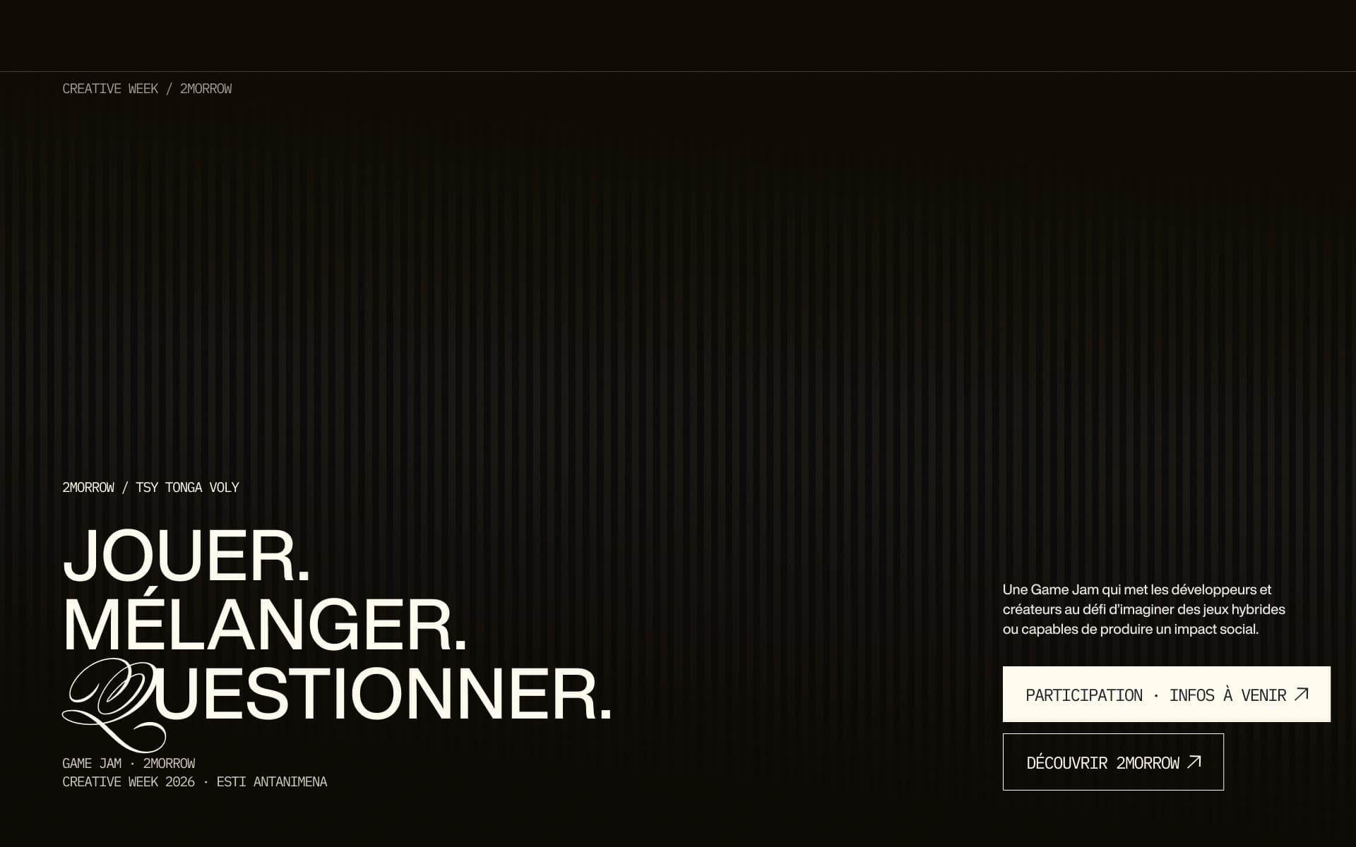
- › TSY TONGA VOLY · game jam
- › STORM / Creative Jam · graphic design
Creative Gala and Awards
- Creative Gala
- Awards
- Laureates
Taking part
- Open calls
- One application file in six steps
Ticketing
- Tickets
- Checkout
- Confirmed ticket
About and Contact
- About
- Contact
- Partners (home section)
Read from the real-content home navigation and page set, consistent with the live website.
02 / The challenge
How do we help different people find the right path?
Preserve the energy of the edition’s identity while organizing a large amount of changing information into a clear, responsive experience.
03 / Audience and tasks
Audience and tasks.
Audience 01
Visitors
- Dates and venues
- Programme
- Practical information
Next step: Creative Week
Audience 02
Competition participants
- Eligibility
- Rules
- Deadlines
- The participation route
Next step: Taking part
Audience 03
Professionals and partners
- The initiative
- The event format
- How to get involved
Next step: About and Partners
Audience 04
Gala audience
- What Creative Gala is
- When it happens
- How it differs from Creative Week
Next step: Creative Gala
Derived from the programme and website requirements; no user interviews documented.
04 / UX decisions
UX decisions.
A
Separate the two event experiences, preserve one clear identity
Two events with different roles, one identity: the site must make the difference obvious.
Trade-off
Ease of orientation versus fragmentation of event information.
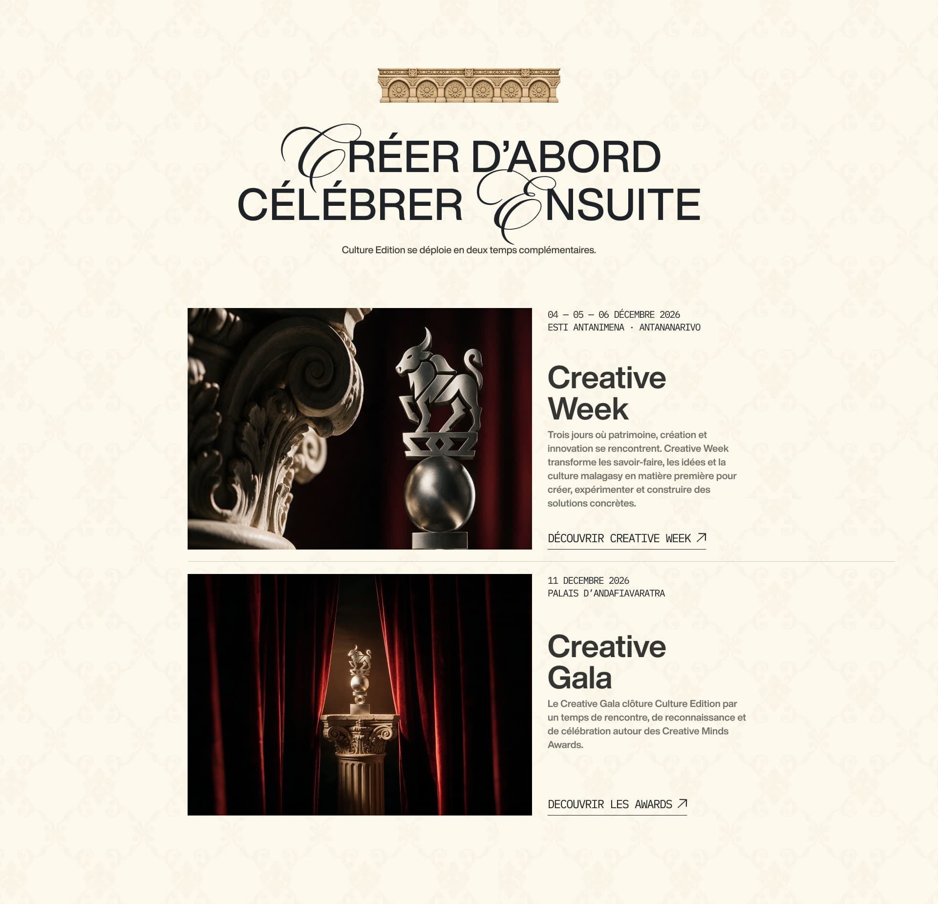
Authentic screen · Home 2026, events sectionDecision A as designed: one card per event, dates, venue, own link, same visual language. B
Organize the participation journey around questions people ask
Visitors should answer their first questions in order, without the whole rulebook.
- EligibilityAm I eligible?
- SubmissionWhat can I submit?
- DeadlineWhen?
- RouteHow?
- Follow-upWhat happens next?
The participation journey as the questions people ask (decision B). 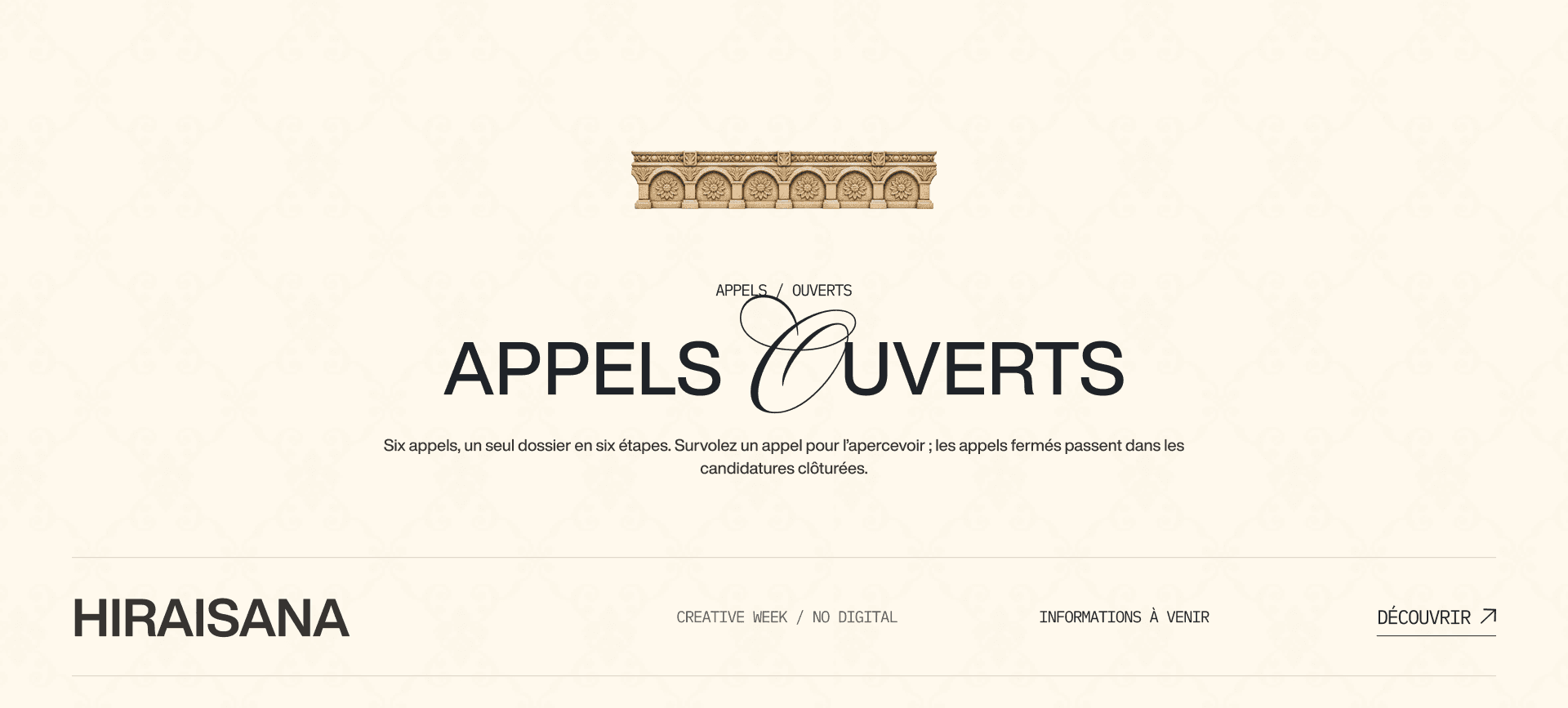
Authentic screen · Participate page, excerptOne row per call: programme, status, link. Designed page, where the status still reads “to come”; the live site carries the current calls. One row per call, the rules one step further
- Problem
- Six calls with their own rules would bury the first questions if shown at once.
- UX principle
- Progressive disclosure (opens in a new tab) · Nielsen Norman GroupThe design follows this principle: essentials in one row, rules and the six-step file behind the link.
- Design decision
- A list of calls with programme, status and one link each.
- Visual evidence
- Open-calls excerpt · competition pages, section 05.
- Outcome · status
- Designed in the 2026 file.
C
Balance expressive art direction with reading clarity
Keep the strong identity of Culture Edition without making schedules, rules and forms hard to read.
Expressive, but nothing competes with the information
- Problem
- A loud layout would make schedules, formats and actions harder to read.
- UX principle
- Aesthetic and minimalist design (opens in a new tab) · Nielsen Norman GroupThe competition page and the mobile menu illustrate it: one statement, one line of facts, two actions; a plain numbered menu.
- Design decision
- Few elements per screen, practical information in short labelled rows.
- Visual evidence
- TSY TONGA VOLY page, section 05 · mobile menu below.
- Outcome · status
- Designed in the 2026 file.
D
Plan for mobile event discovery
Event information is read on phones: navigation, dates and actions must work without hover or complex motion.
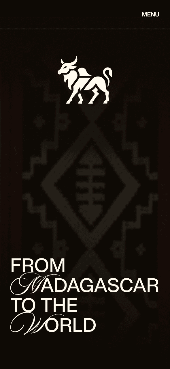
Authentic screen · Home 2026, mobileThe identity holds at phone width: emblem, textile, title. 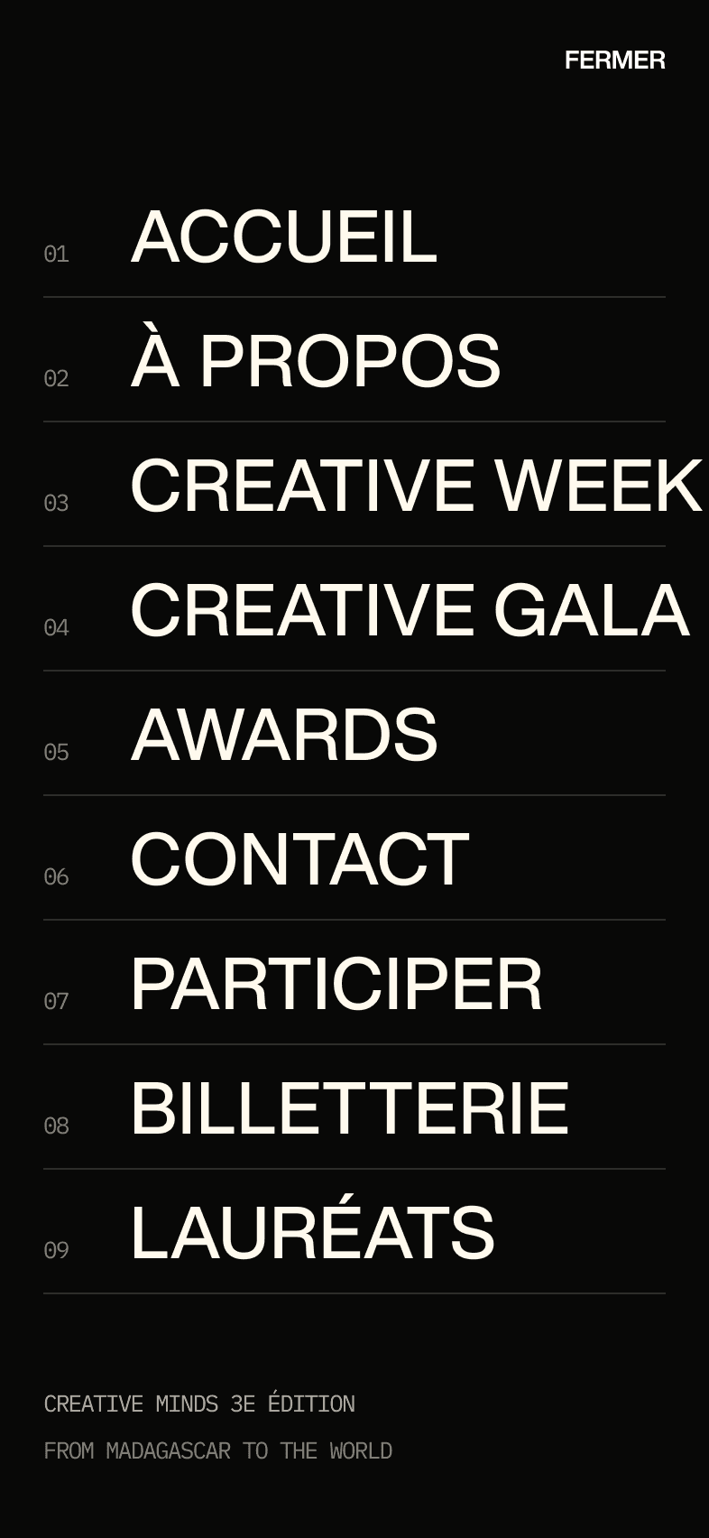
Authentic screen · Mobile menuThe menu: nine entries in a numbered list, the same destinations as desktop.
05 / Inside Creative Week
Two competitions under one programme, one page each.
Creative Week hosts HI-1-SANA, a collaborative non-digital art competition, and 2MORROW, a programme of two competitions: TSY TONGA VOLY, the game jam, and STORM / Creative Jam, graphic design. Each competition keeps its own page on a shared skeleton.
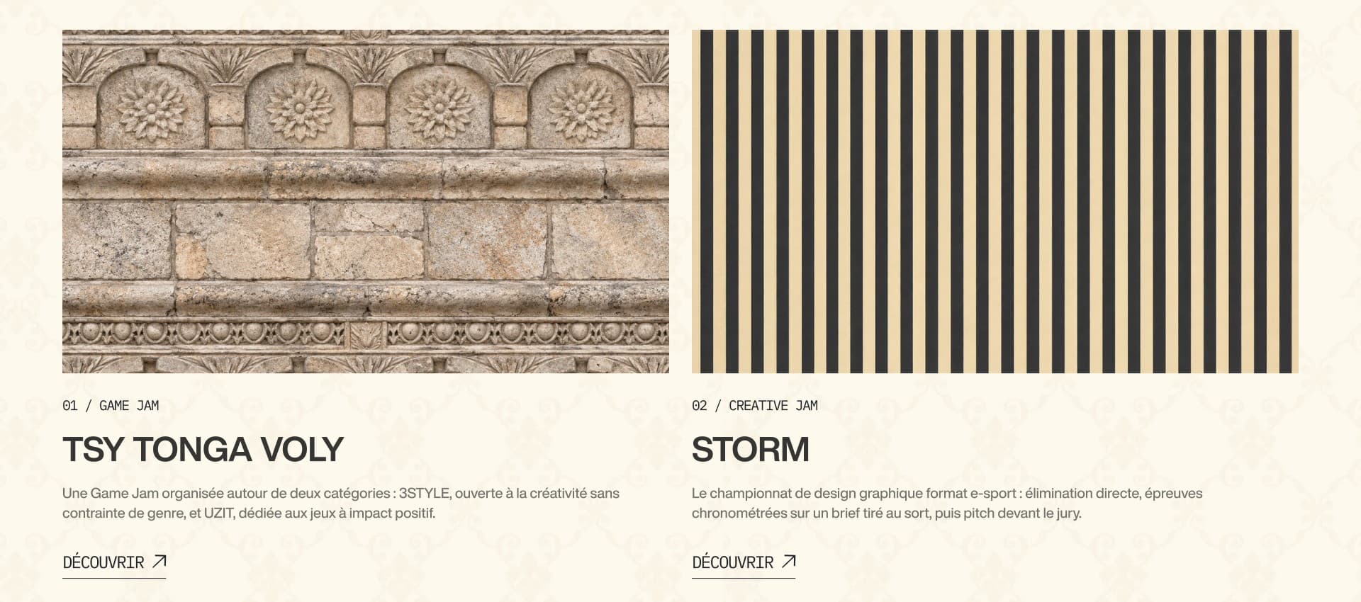
Hierarchy confirmed by the organisers; rules and dates are published on the website.
06 / In sequence
From the home to a competition page.
Three authentic screens in the order a visitor meets them: the home, the 2MORROW programme, the TSY TONGA VOLY page. The sequence shows the hierarchy, Creative Week › 2MORROW › one competition; the transitions are presentation only, not a recording of the website.
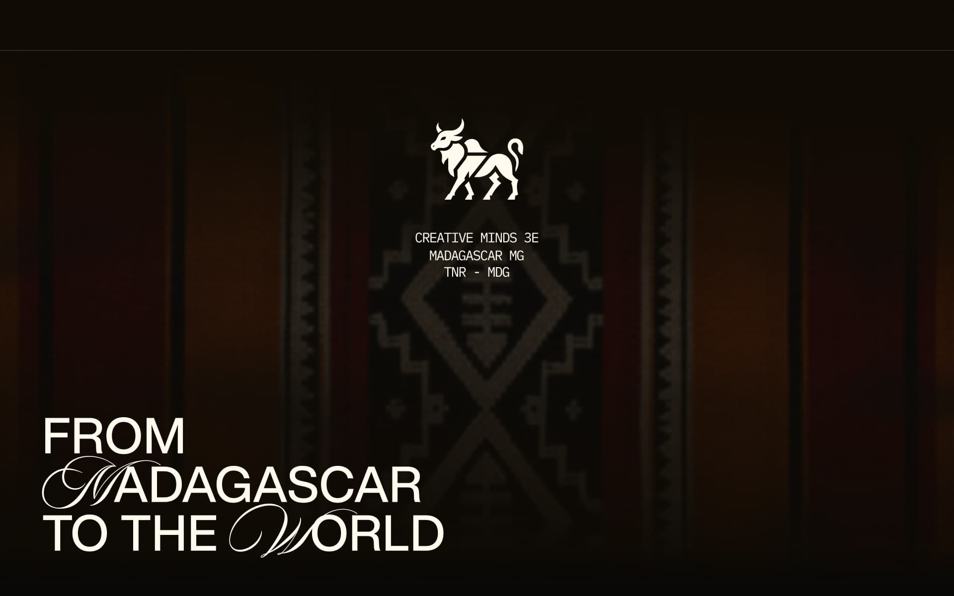
Scene 1 of 3 · Home · From Madagascar to the WorldThe theme before any schedule: emblem, woven textile, title.
Screens of the 2026 design file, consistent with the live website; the 2MORROW excerpt is shown whole on the soft surface.
07
My role.
I design the UX/UI of the website and help organise Creative Week, which keeps the site close to the event; design, content, production and organisation are collective work.
08
Outcome and present status.
Status · October 2026
Website live · third edition in December 2026
The website is live; the screens shown come from the design file and match it. Ticketing and checkout screens are not reproduced (provisional dates, demonstration data). No attendance or satisfaction result before the edition.
09
Reflection.
The website succeeds not by looking like the event, but by helping people understand what is on and how to take part.